PROFESSIONAL WORK
3D DESIGN. TOUR POSTER ILLUSTRATION . EP COVER ART
2024 - 2025
CLIENT'S : OAKNORTH . CELESTE . MOSES
Final Design
2024
Introduction
Project overview: The goal for this project was to develop a mascot and then develop a 3d print of this model which will be used as a part of the banks image and business development.
Challenges:
Learning a new program and having to create a model which was 3d printable.
Using the brands existing image and keeping with OakNorth's aesthetic when coming up with a design.
Results:
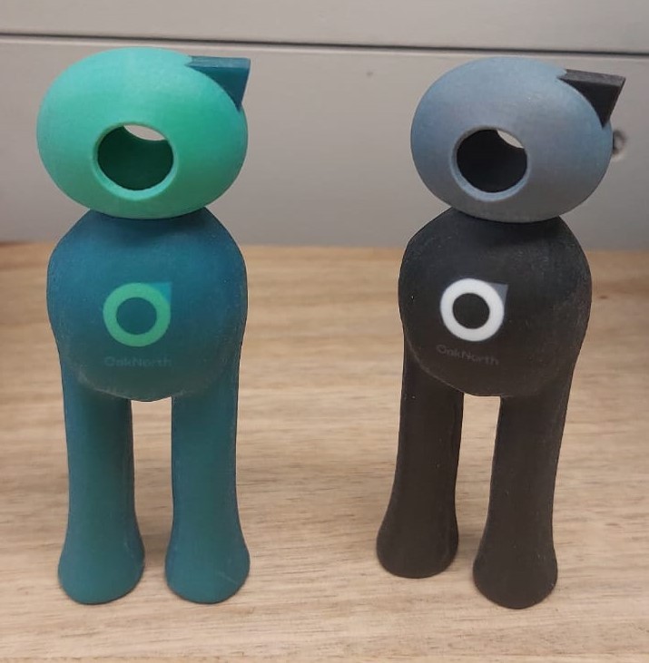
Created a 3d Printed model which can be used by the client to print off as many version in the future as they like.
built a professional relationship with a client and have now completed two jobs for them.

Initial ideas and sketches
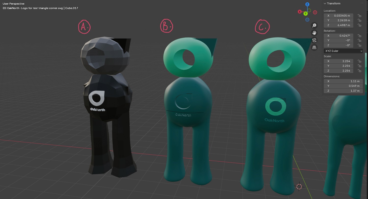
I began doing what I know best and developed some initial sketches for my client, however this time as I was working in 3d for the first time I wanted to develop the sketches .
Key Insights:
Client prefered option A in terms of the initial sketch and the last option with the 3d sketches.
Model making was tricky to first understand.
Moving forward from this before pushing a more finished design I decided to use my research skills to understand the market and give my client a more thoughtful product.
Research & Reference
I went out looking all over for what I could use as inspiration, my client gave me some keywords of what they want their company to represent and with this I was able to gather a good collection of source material to inform the finished 3d model. Finding a good place to 3D print the model as well required quite a bit of research, I was able to land on '3d Printworx' a small company who was incredibly helpful in helping us understand the printing process and that where also able to provide a full colour printing service.
Key Insights:
OakNorth's previous logo was a tree and represented community, this information helped make a character which my client felt was abstract enough to be understood by the wider customer base.
3D printing isn't as straightforward as It sounds, there aren't many full colour jet 3D printing services.

Define & Outcome
Final Design
2025
Introduction
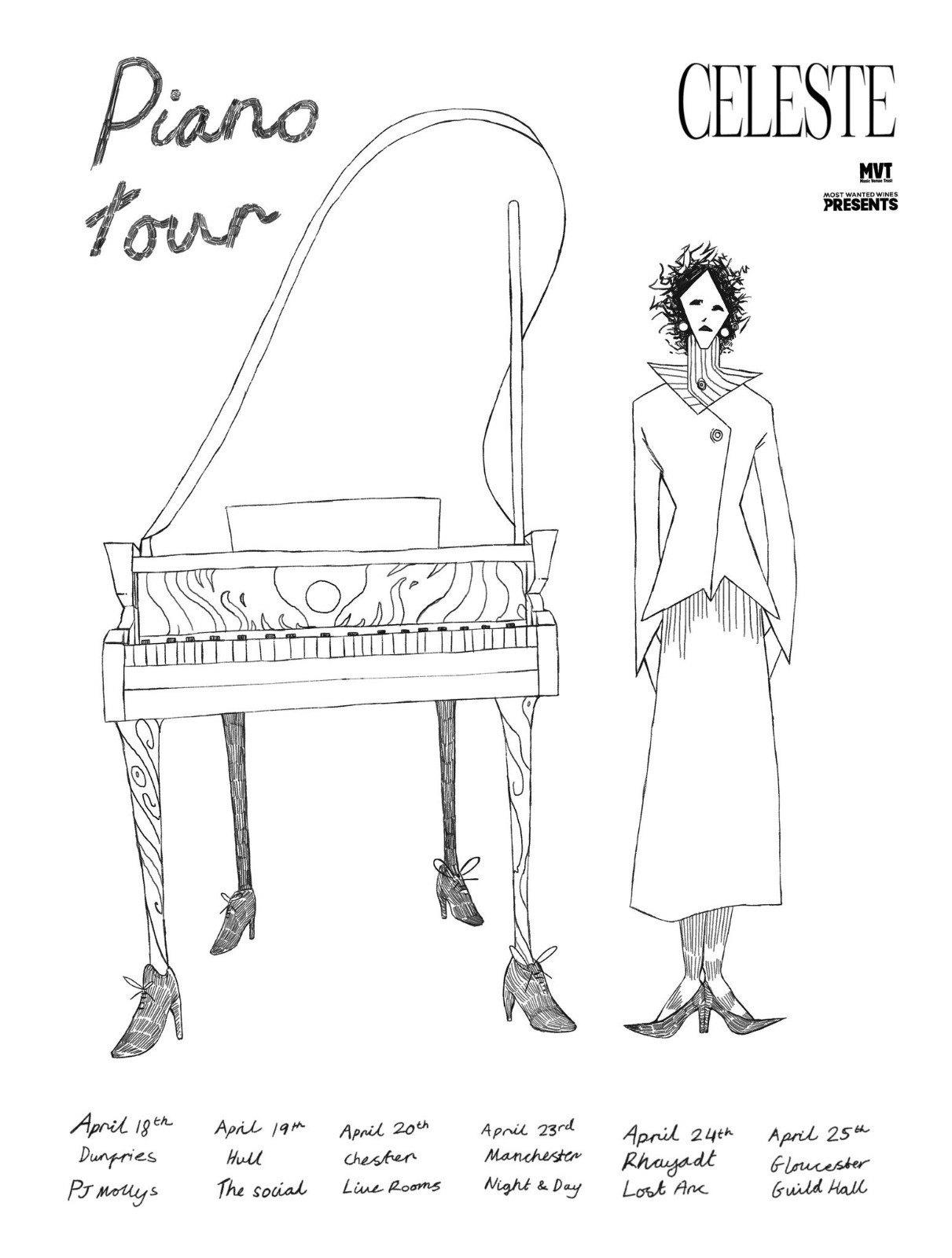
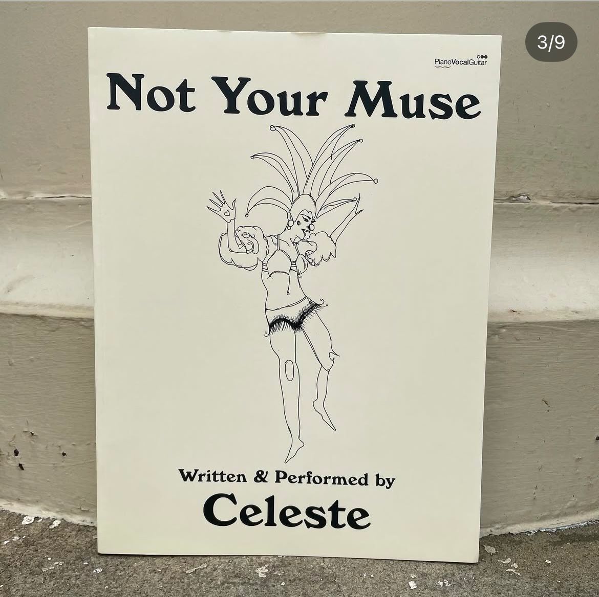
Project Overview: Made a tour poster design using Celestes vision and sketches, went through plenty of iterations until we landed on something which was close to the idea she had in her head.
Challenges:
Communicating ideas clearly, and using the best language possible to understand what I can do to help bring her ideas to life.
Working efficiently and under tight time constraints.
Results:
Created a poster which seamelesslty shows more of her as an artist, and keeps relevant information where it should be.
Learned how to work well under pressure and was able to make sure I was asking the best questions possible to make sure we didnt waste the small amount of time we had.
Initial Ideas & Sketches
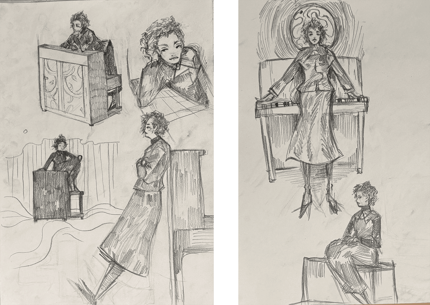
I began with some very loose sketches trying to display more my artistic style, as this was the very early stages of the project. I was able to show I was good for the job with these initial sketches, this stage of the process is very important as getting the client excited early on will lead to a good project.
Key Insights:
Celestes team where happy with what was shown, keep the same style throughout further drawings.
Stay inline with her vision and to explore a more abstract idea with the characters appearance.


Client Feedback Iterations
From the first feedback I'd received I wanted to establish a style and character she was happy with so then before moving onto a more finished poster design I gave My client 4 options in terms of character style and 2 options in terms of font style. We wanted to keep it looking like a sketch and to go with a fully hand done style including the writing. With this We went with option C for the character and option A for the font and text style.

Finishing Touches
I was lucky enough to receive a sketch from my client, with this I was able to do a drawing side by side to the vision she had, this streamlined the ideating process a lot and we where able to get to a more finished place quite quickly.
Key Insights:
Developed a shared visual language through collaborative drawing
Improved creative understanding and team synergy.
Successfully translated abstract ideas into a cohesive and visually compelling tour poster.
We where able to finish strong and had a few options for her and her team to use for their tour.

Final Illustration
2025
Introduction
Project overview: This project was given to me by a guitarist who wanted some cover art for their ep and a design which could be used on a t-shirt which would be printed and sold alongside the launch of the music.
Challenges:
Learning a new style of illustration and keeping the clients vision in tact with each step of the process.
Being given complete free reign with the idea and having no direction meant there was alot of guessing which had to be done.
Results:
Created a engaging piece of artwork which helps the artist stand out from the rest.
Alligned with the style of music and image their portraying through their work.
Thumbnail Designs & Merchandise
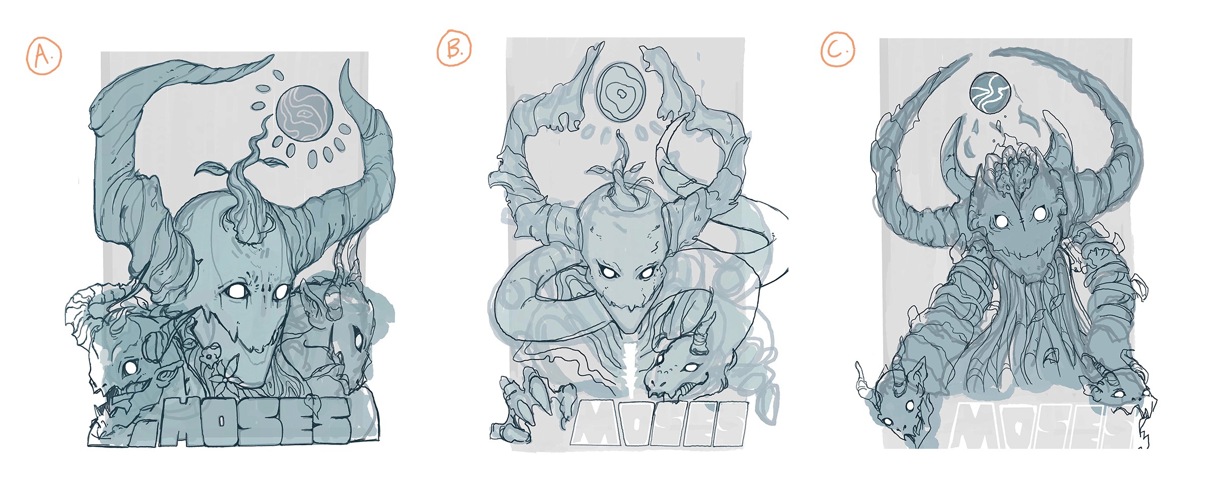
Project overview: We began by creating three thumbnails, The only direction I was given was that they wanted a mask the text moses and some sort of creature in the image, this led me to create these options. overall we picked option B to be developed as a full colour illustration.
We ended up also choosing option C afterwards as a clean line drawing to create a whole line of t-shirts and merchandise.